CONCEPT
rüt (pronounced root) is a human wellness company aimed to embrace the beauty of the body-mind connection. This Tulsa-based company focuses on providing services that reconnect individuals to their authenticity (their root) in a raw and inviting way.
Revision Studios was approached to create a full rebrand that could communicate diversity and inclusion in a new way (contrary to the mundane standard of the wellness industry)
Together, we were able to evoke a powerful and authentic connection with rüt’s audience by fostering a sense of humanity through their brand strategy.
We now have a new image in rüt
SERVICES
Creative Direction & Strategy
Branding & Identity
Photography
Videography
TEAM
Revision Studios
Anler Hernandez
Maxwell Shavers
Josh Stewart


Beginning with the RÜT wood mark, we created a curvy type system to personify the brand’s character and mold-ability while being organic to ensure it can elevate all accompanying elements and assets. We then paired a sleek and digestible typography and work marks to create a sense of balance. This allowed space for wordmarks to embody just enough character while not being too disruptive to the essence of wellness RUT fosters.


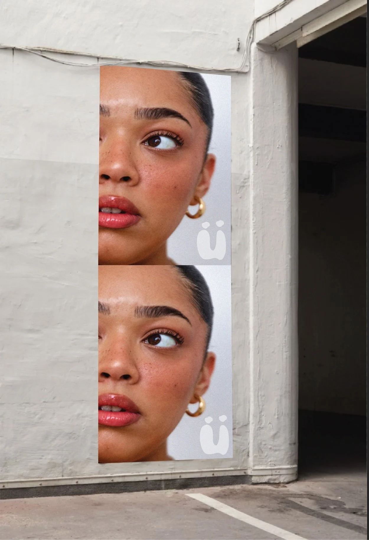

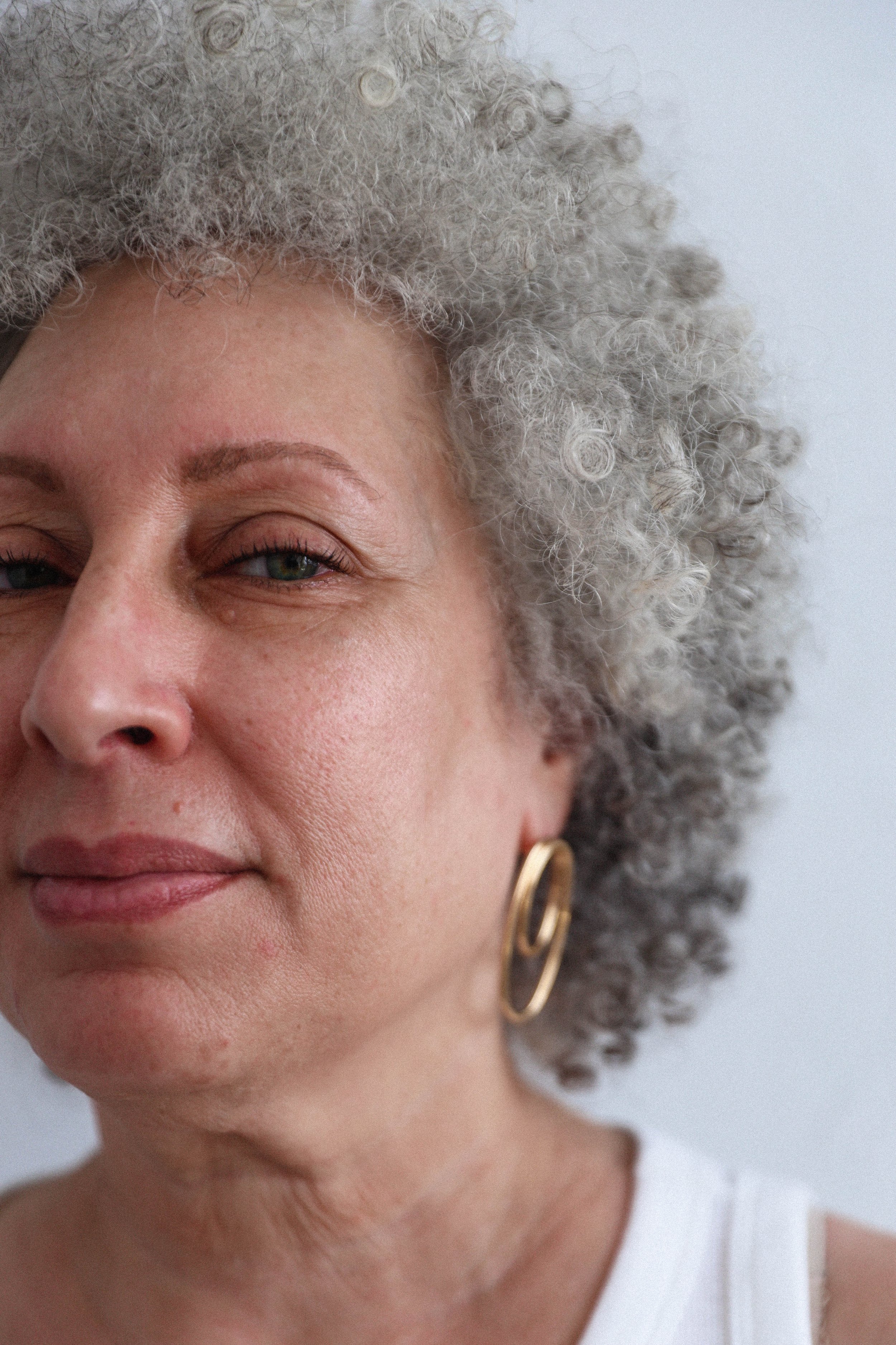
rüt’s color palette consists of a collection of neutrals and nudes. This was curated to highlight the diversity in the human body's undertones. Our color system established key tones but could be expanded for further application to allow flexibility and inclusiveness.

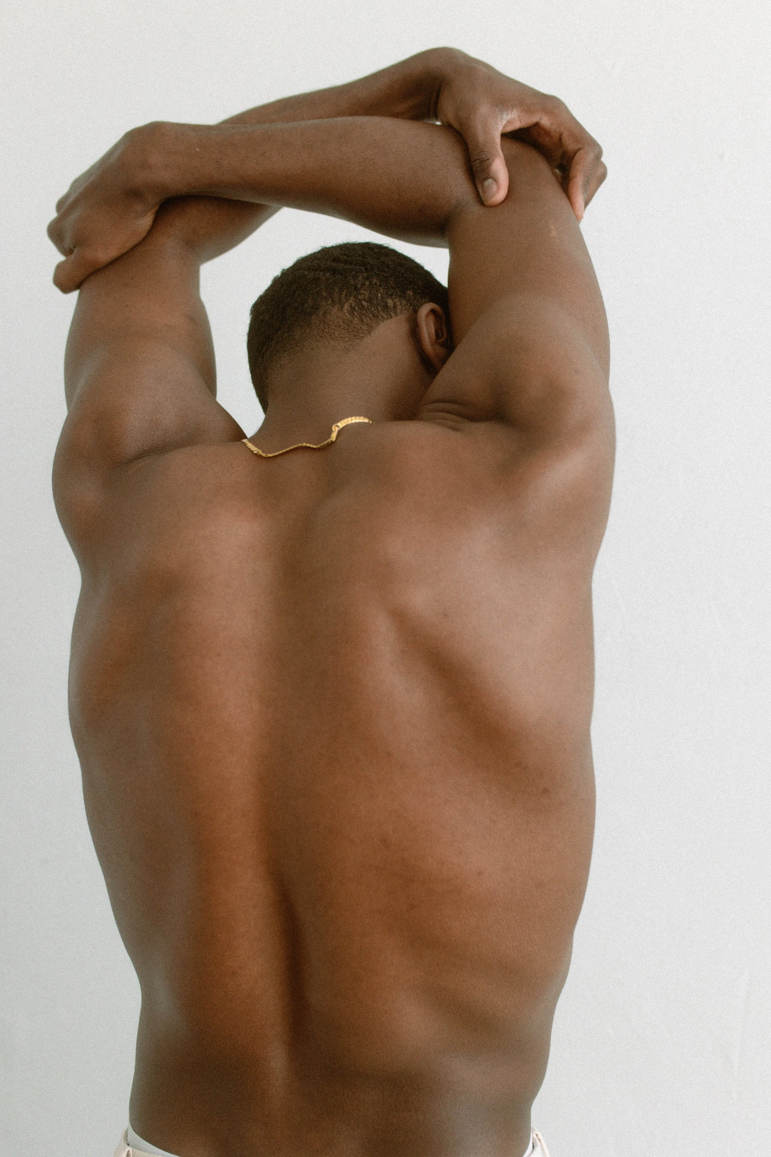
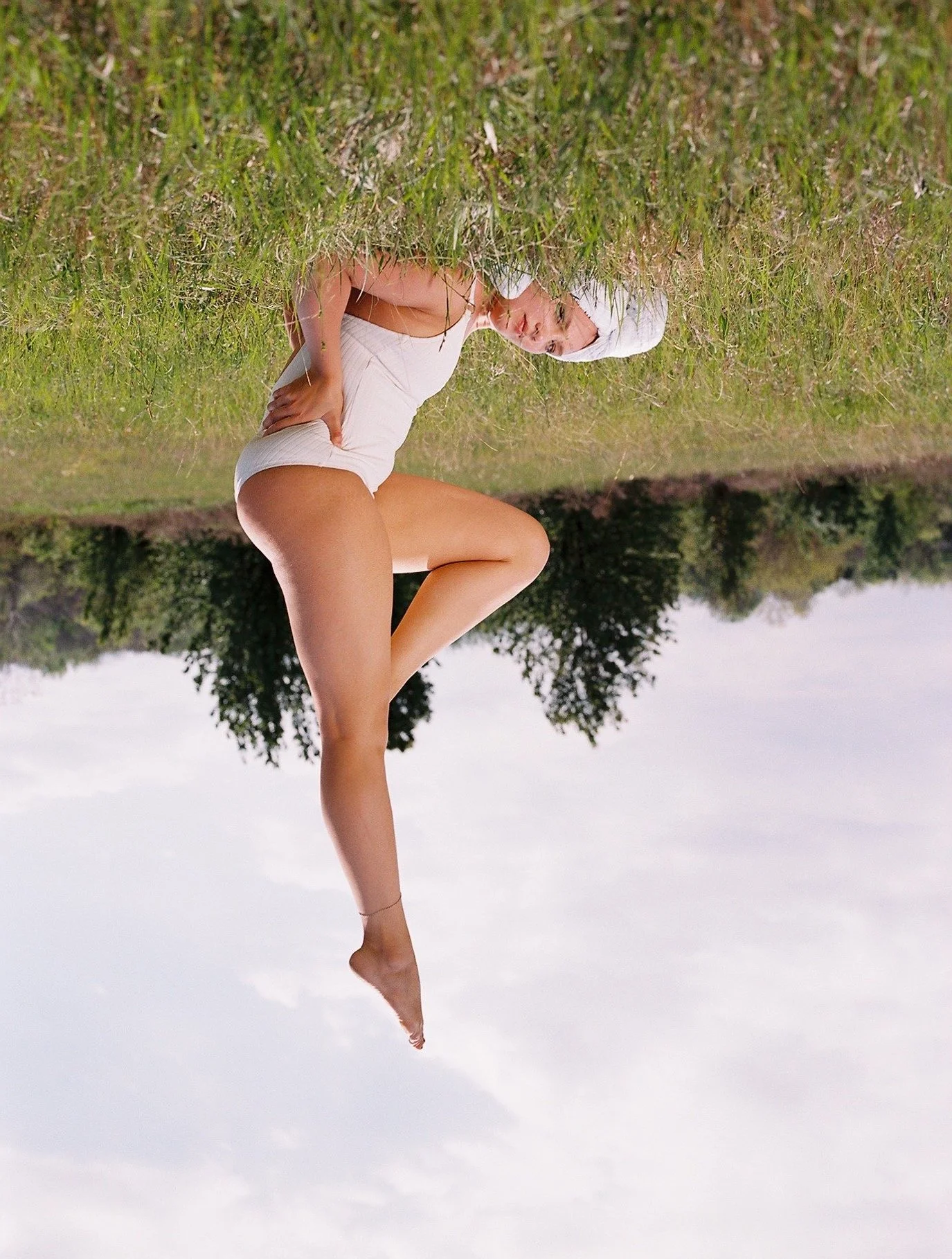
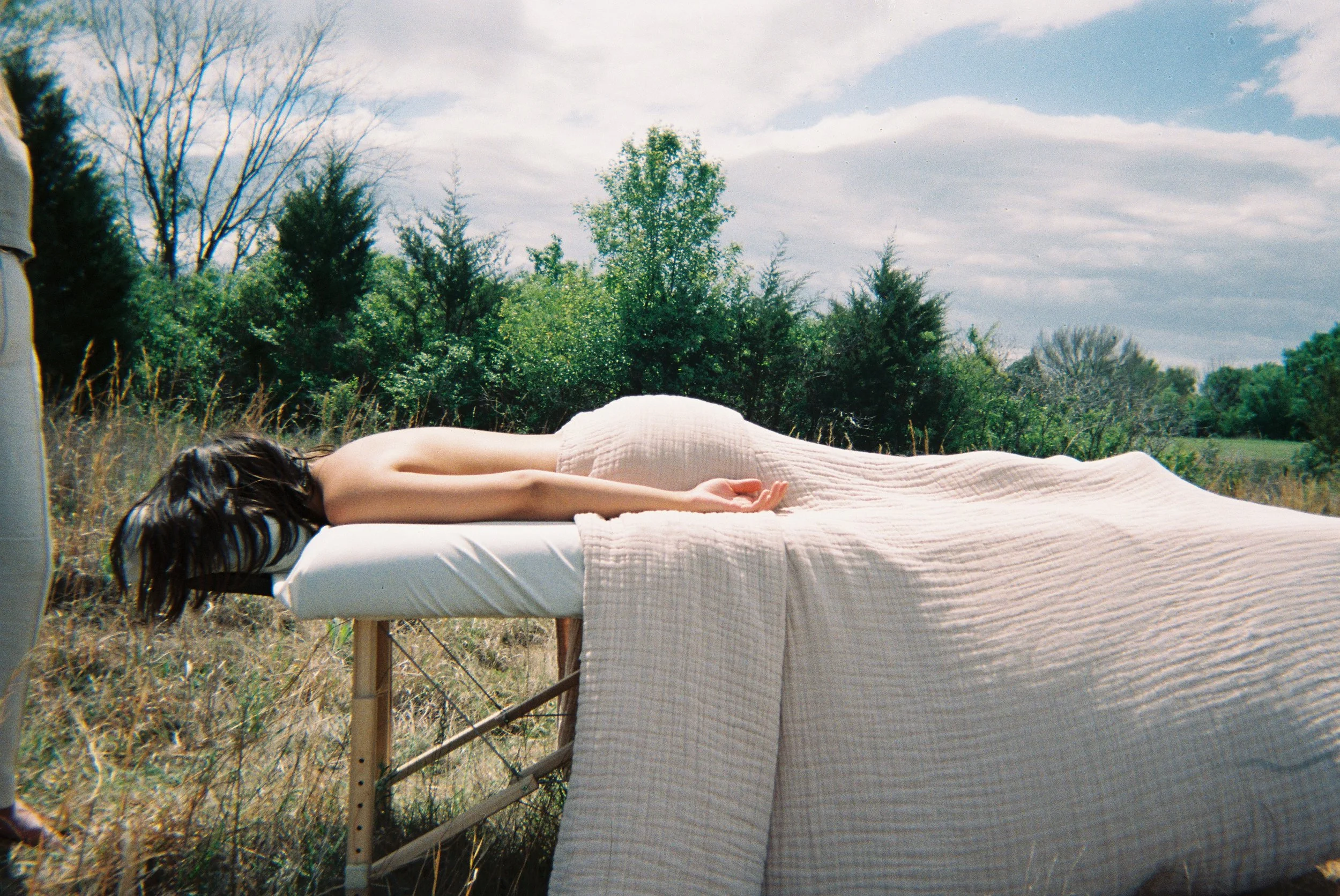
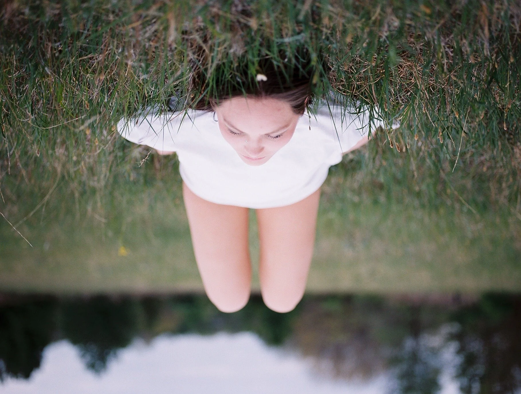
To honor the real and raw experiences of many; our key concept for photography was to illuminate the diverse and individual relationships people encounter on their journey towards wellness. Our strategy encourages the audience to embrace their vulnerability and use them as a source of resilience and self-discovery. After all, RÜT is a brand that serves as a beacon of light, guiding individuals on their journey of self-discovery through immersive experiences and community-driven support.
From there, we produced unorthodox images contrasting the human body, and its movement to the earth: a place where one finds their true root. Our use of raw imagery, sensory details, and evaluative language immerses the audience into a narrative that makes them feel deeply connected to the brand.